Competing on outcomes,
not just price.
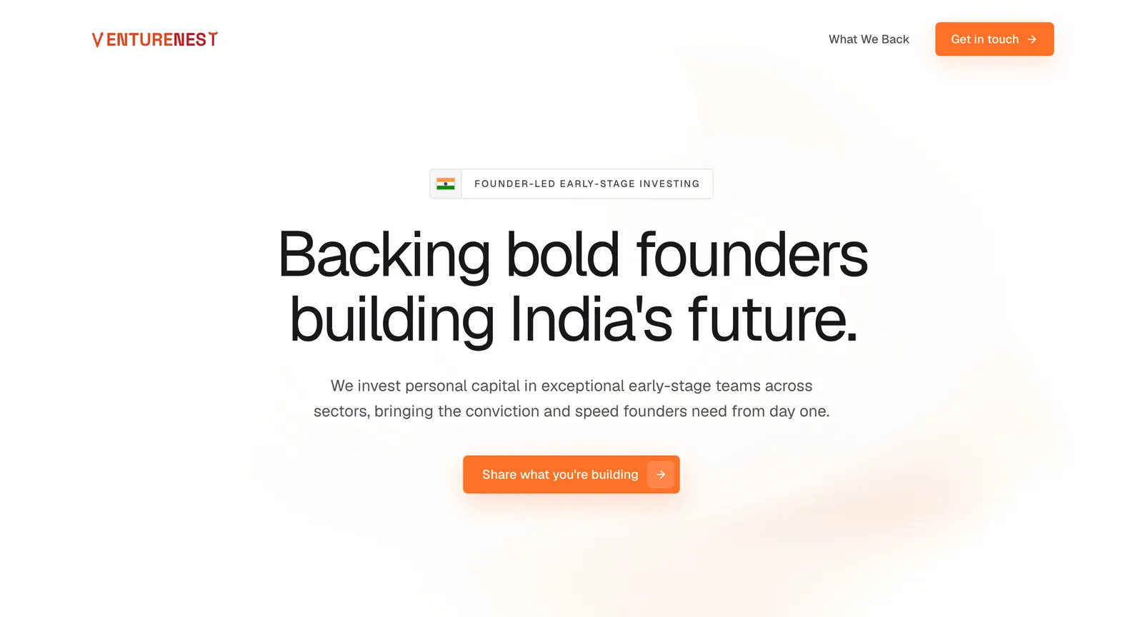
Early-stage funds mostly look identical online: a portfolio grid, a team page, a generic contact form. VentureNest's actual differentiator is that it invests personal capital and moves with founder-speed conviction - but that is a difficult claim to make credible, and an over-designed site would have undercut it immediately.
Building a site that
turns visitors into clients.
Restraint as Positioning
No portfolio wall, no stock photography, no manifesto. A fund that claims speed and conviction has to look like one, and a heavy site would have contradicted the pitch.
One Honest Call to Action
"Share what you're building" replaces the usual submit-your-deck form - phrased to invite a conversation rather than start an application process.
Clear Investment Scope
A plain statement of what they back, so founders self-qualify before reaching out and the fund's inbound stays high-signal.
A focused inbound channel for founders, where the entire page does one job - get the right person to describe what they are building.
Scale Your OutcomeNext Project
Sunshield Solar